Looking the part
A look as forward as their thinking
Illuminas has been answering the big questions of tech’s biggest and brightest for over 20 years. Based in both Austin and London, the newer Austin-based team wanted to visually establish themselves in a way to stand out in the American tech scene.


Order from chaos
As a person that regularly interprets web analytics, creating order from chaos was a visual that kept pulling me in when thinking about where my team could take this client.
We wanted to create a look that was active and had some edge to it, but could stand out whilst feeling right at home in the tech ecosystem.
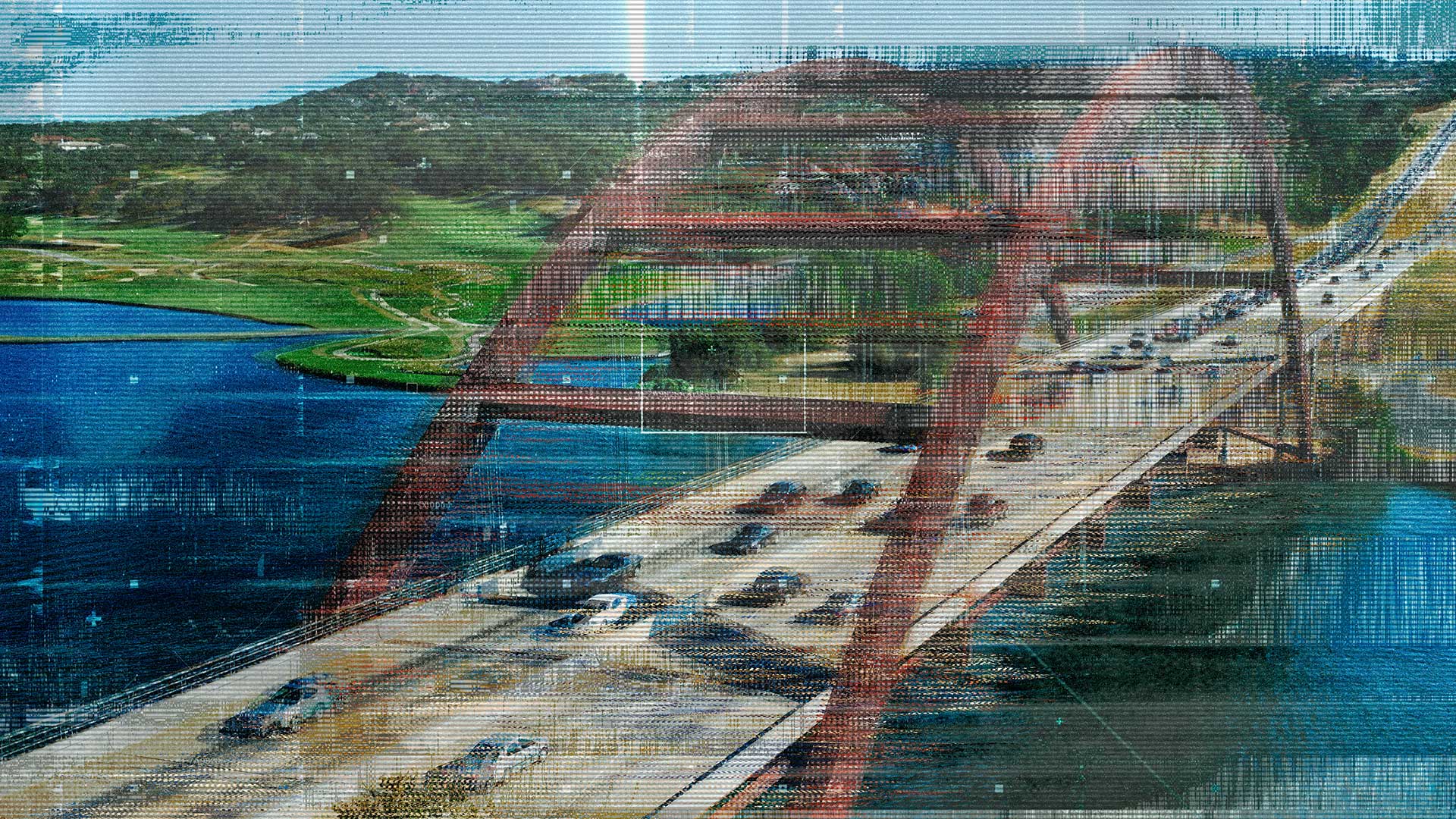
The end result was a mash-up of glitch-art inspired photo treatments, angular page elements, and a hint of monospaced type as a throwback to data and code views. Scroll down to have a look.


Credits
Creative Direction, UX, and Development by Noe Perez
Art Direction + Design by Kat Gibbs, Reid Munkres, and Noe Perez
Copywriting (Headlines) by Raul Garza and Laura Messer-Jackson